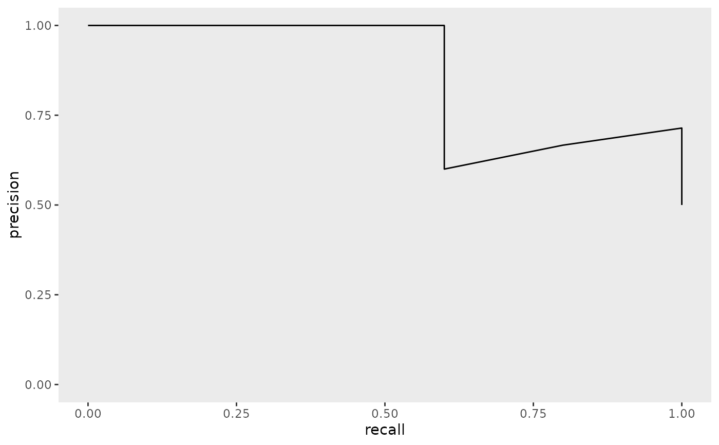
Plots the precision-recall curve given a set of test data plus predicted AMR phenotypes.
plotPRC(test_data_plus_predictions)Arguments
- test_data_plus_predictions
Test data (tibble) with an added column for predicted phenotype labels, such as the output of
predict().
Value
A precision-recall curve as a ggplot2 object
Examples
preds <- tibble::tibble(
  genome_id = paste0("g", 1:10),
  genome_drug.resistant_phenotype = factor(
    rep(c("Resistant", "Susceptible"), each = 5),
    levels = c("Resistant", "Susceptible")
  ),
  .pred_class = factor(
    c(
      "Resistant", "Resistant", "Susceptible", "Resistant", "Susceptible",
      "Susceptible", "Resistant", "Susceptible", "Susceptible", "Resistant"
    ),
    levels = c("Resistant", "Susceptible")
  ),
  .pred_Resistant = c(0.9, 0.8, 0.4, 0.7, 0.3, 0.2, 0.6, 0.1, 0.2, 0.55),
  .pred_Susceptible = c(0.1, 0.2, 0.6, 0.3, 0.7, 0.8, 0.4, 0.9, 0.8, 0.45)
)
plotPRC(preds)